Youth Education Nonprofit: User Research & Website Redesign
Comprehensive user research and website redesign for an Austin-based youth education nonprofit.
The Challenge
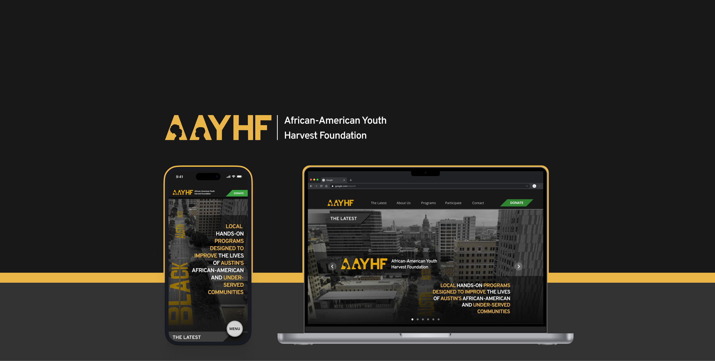
The African-American Youth Harvest Foundation’s (AAYHF) website was outdated, broken in parts, and not driving volunteer sign-ups or donations.
It lacked clear program info, had technical issues on key pages, and wasn’t optimized for mobile.
Goal
Redesign the site to increase engagement, make it easy to navigate, and reflect the organization’s mission and impact—especially for parents, volunteers, and donors.
Project Type
UX Research & Website UI Redesign
Client
African-American Youth Harvest Foundation (AAYHF)
Team
4 Designers
My Role
Research, UX Design, UI Design, Writing, Wireframing, Prototyping, Final iteration
Research
Our research focused on understanding AAYHF’s supporters and program users, with the goal of uncovering how to increase donations, volunteer sign-ups, and overall engagement.
Research Highlights
To learn about the users of the site and their preferences for engaging with or supporting nonprofits, we conducted:
16 Surveys
8 User Interviews
4 Contextual Inquiries
Stakeholder Meetings
Competitor Analysis
Key User Insights
Parents want clear program details before enrolling their children.
Donors need transparency and proof of impact before contributing.
Volunteers respond better to direct invitations to get involved.
Users prefer a mobile-first, visually polished, and scannable website.
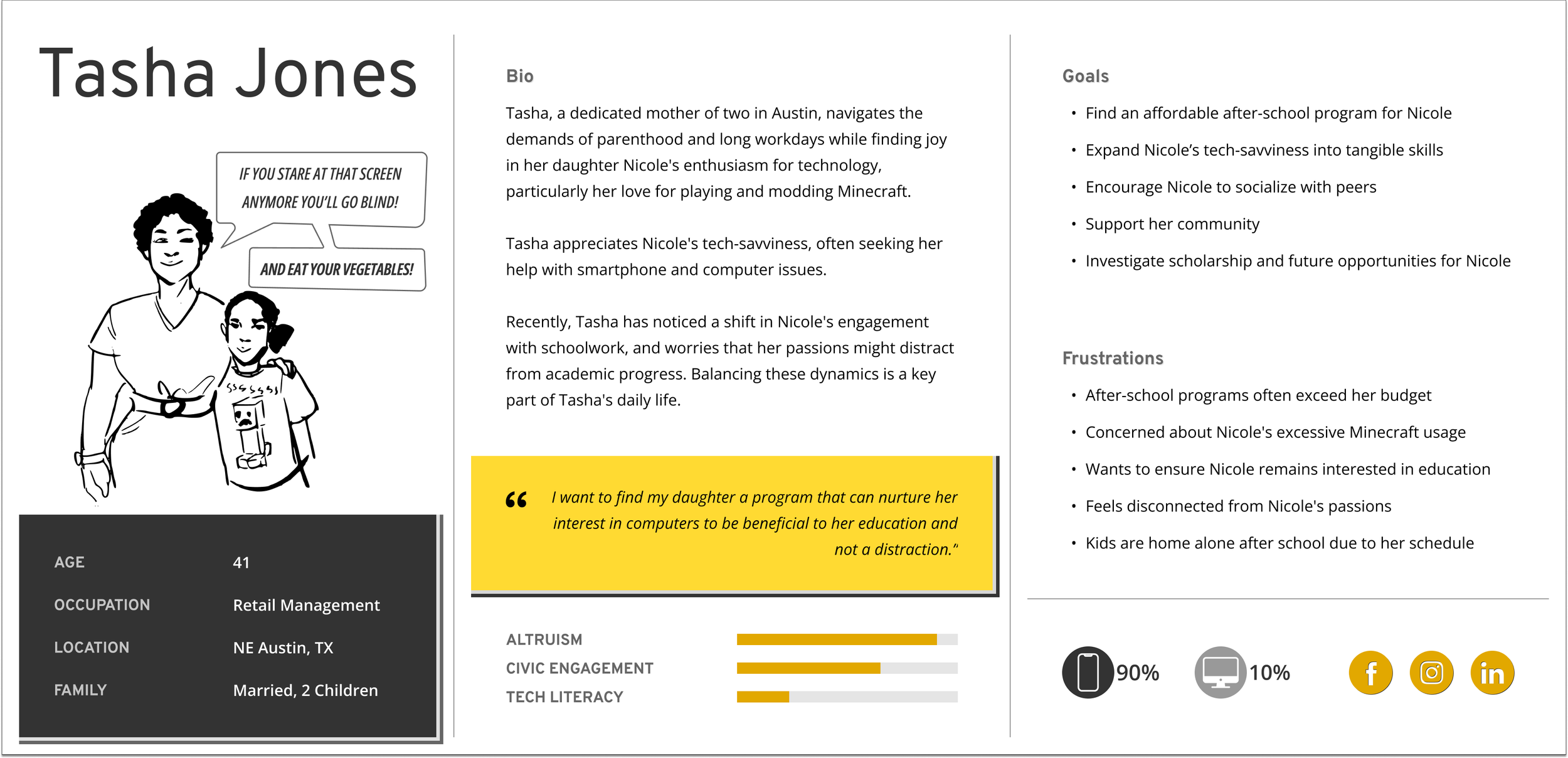
Defining the User
We created personas and journey maps (i.e., “Tasha,” a parent) to illustrate typical site visits: learning about the mission, enrolling a child, and donating—all in one session.
User Needs
Easily find and understand AAYHF’s programs
Trust the organization through clear messaging and data
Take action quickly (donate, enroll, or volunteer)
Design Process
To design the solution, we followed a user-centered, mobile-first, and iterative approach.
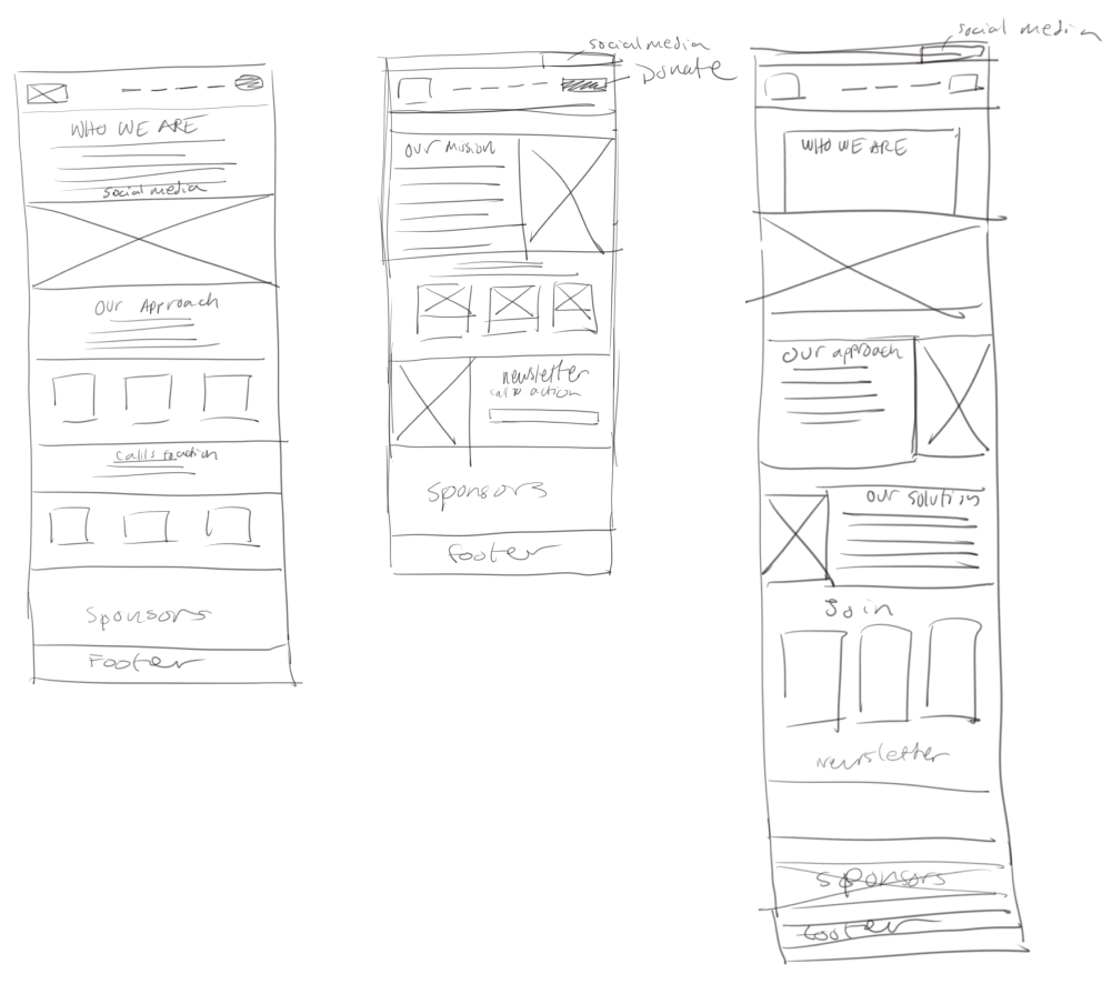
Ideation & Sketching: Turning Insights into Concepts
We used the 4-step sketching method to quickly explore ideas for the homepage layout. In my sketches, I focused on highlighting impact statistics, and driving donations and volunteer signups through clear calls-to-action.
These early concepts helped shape the core structure of the design solution we moved forward with.
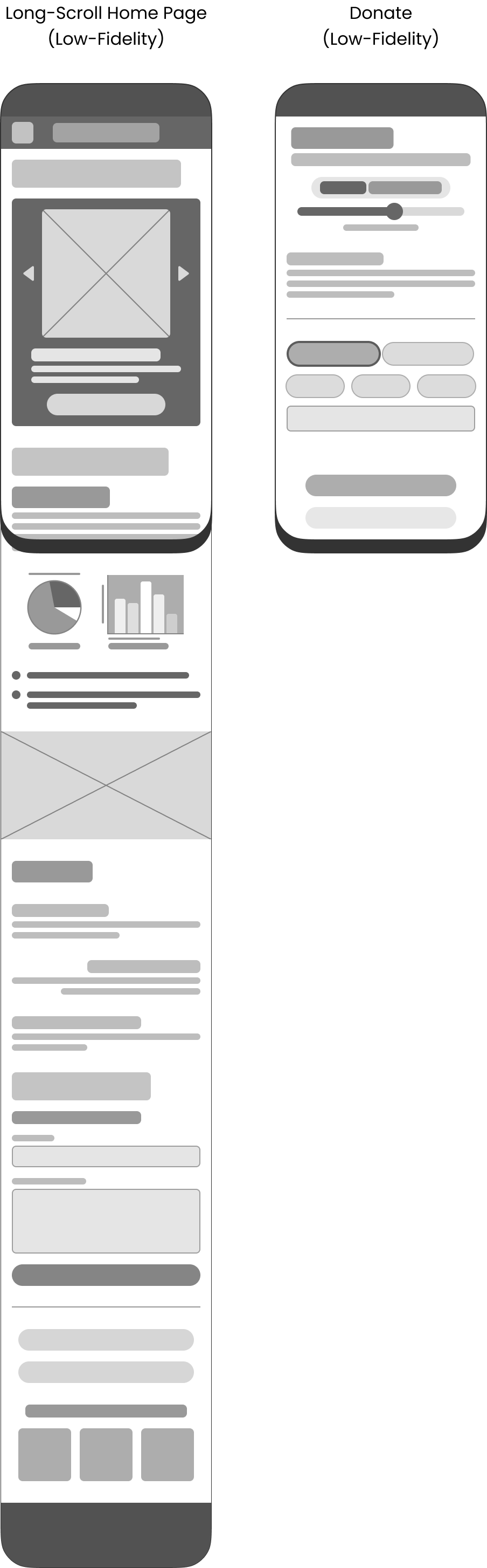
Low-Fidelity Wireframes: Long-Scroll Layout
User research showed that most visitors used mobile devices and preferred quick, scannable content. To support this, I conceptualized a long-scroll homepage that guided users through the mission, programs, and calls-to-action in a single, continuous flow.
This approach:
Supports mobile-first browsing
Increases exposure to key messages and CTAs
Supports a better flow for storytelling as users read about the mission and impact
Reduces friction by minimizing page changes
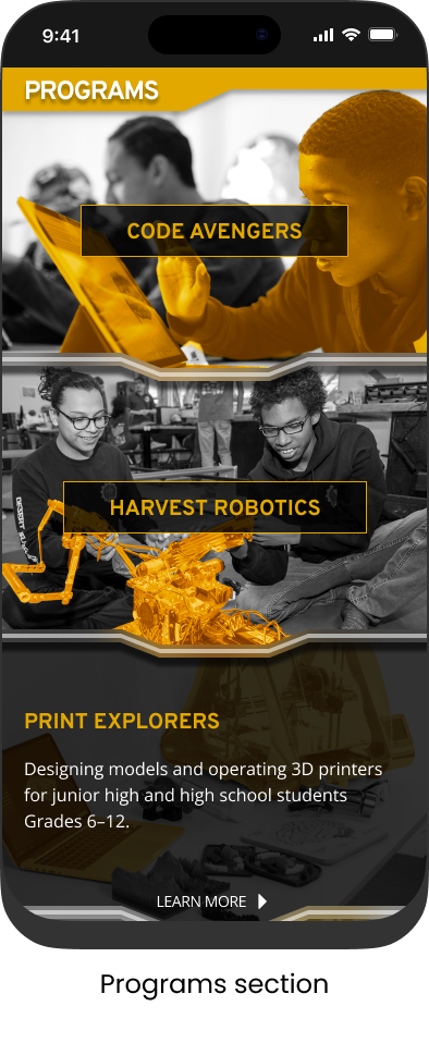
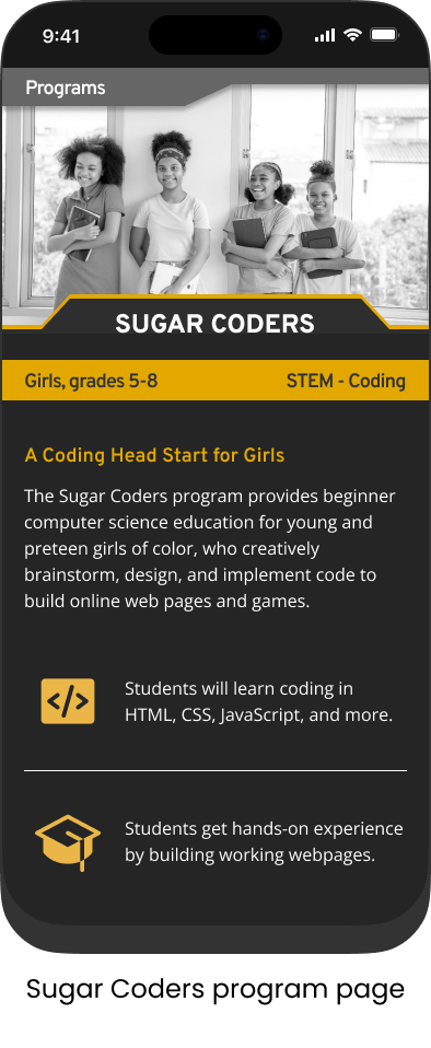
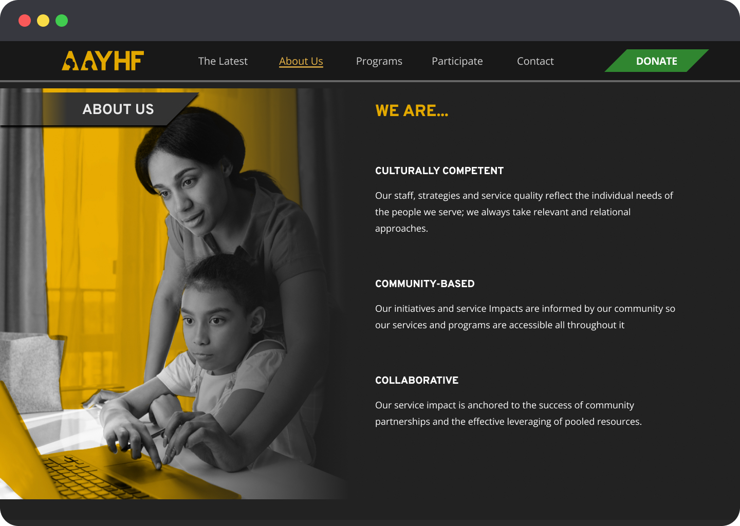
The wireframes arranged content into distinct sections—Mission, Impact, Programs, and Get Involved—designed for clear hierarchy and easy navigation.
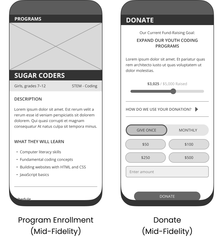
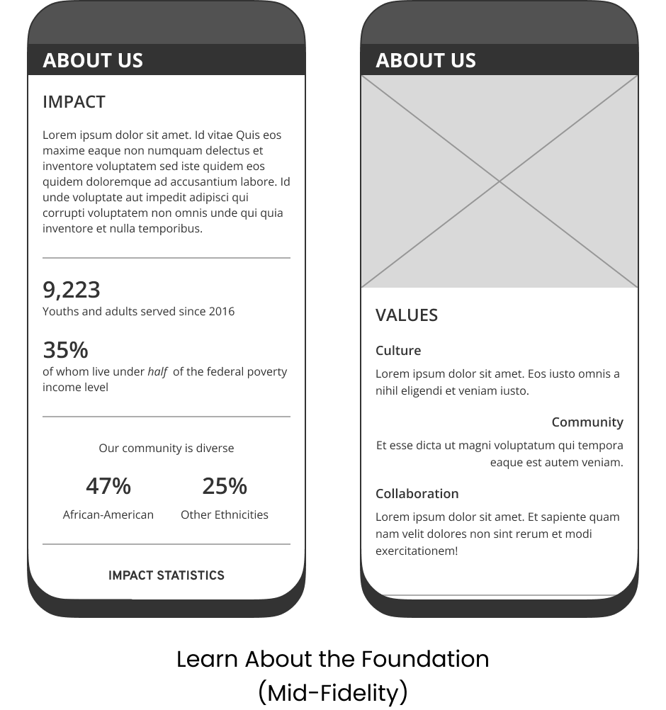
Mid-Fidelity Wireframes: Structuring the User Journey
With the long-scroll layout established, the mid-fidelity phase focused on refining information hierarchy and task flows. We added real content and began mapping out how users would interact with the site—from exploring the mission to enrolling in programs or making a donation.
Key improvements included:
Defined section structure on the homepage to support linear storytelling
Built dedicated screens for donation, program enrollment, and volunteer sign-up
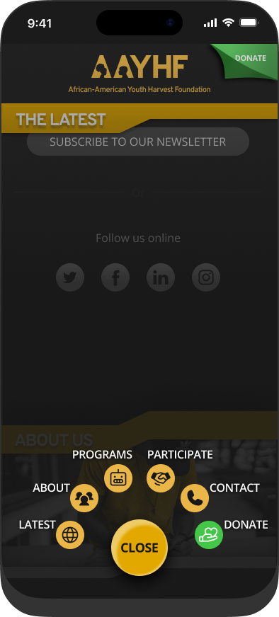
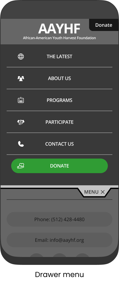
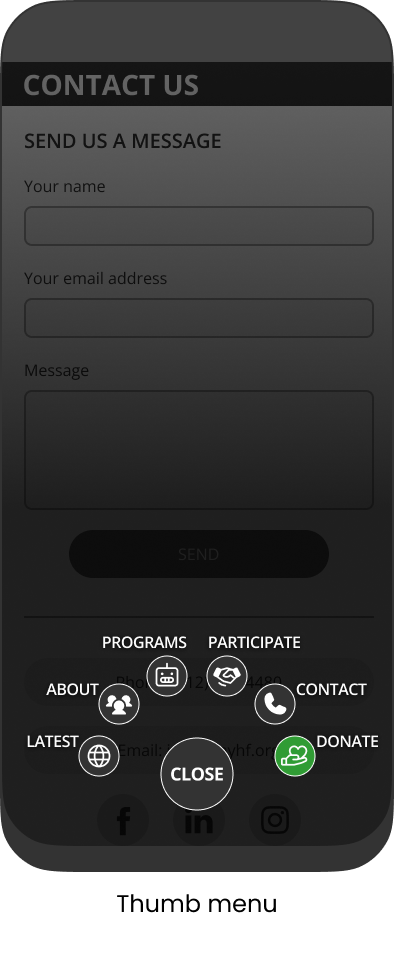
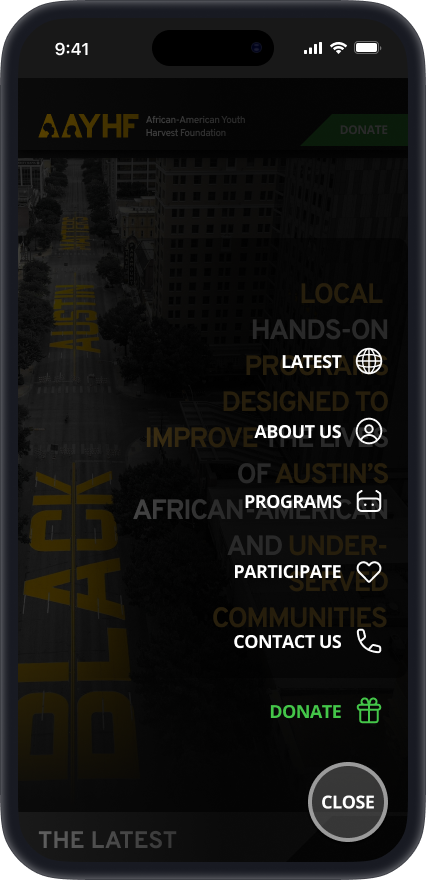
Created menu variations (thumb vs. drawer) to support smooth scrolling and test navigation behavior
These wireframes were detailed enough to simulate real use and helped validate layout decisions before moving into visual design.
High-Fidelity Wireframes: Bringing the Design to Life
In the high-fidelity iteration, I refined layout, visual hierarchy, and interaction patterns based on user testing and stakeholder feedback. This version introduced a new visual style, updated color palette, custom iconography, and more prominent call-to-action buttons.
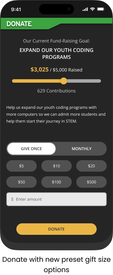
On the donation page, I refined the preset donation amounts to better reflect users’ historical donor patterns shared by stakeholders, helping streamline the process for users. I still included a custom amount field for users that want to donate a particular amount.
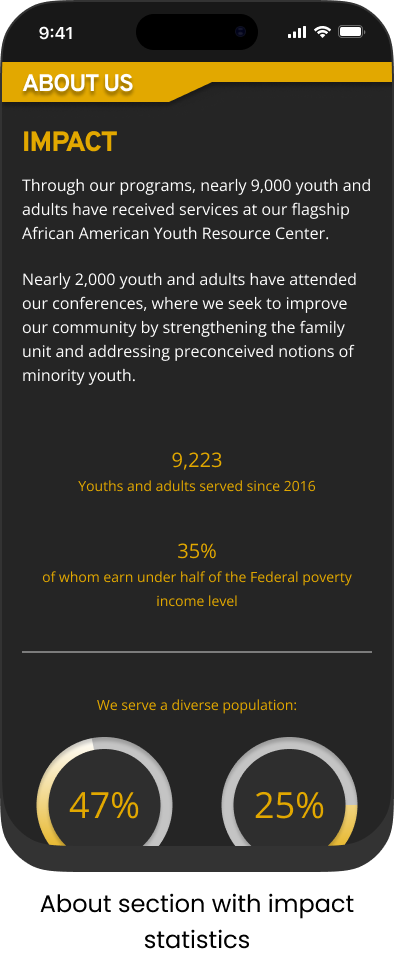
Other updates included emphasizing impact statistics, streamlining content for better readability, and reinforcing AAYHF’s focus on STEM and community through visual design choices.
Usability Testing: Validating the Design
We tested the prototype with 8 users, focusing on three tasks: learning about AAYHF, enrolling in a program, and making a donation.
What we learned:
Users responded well to the long-scroll layout and found the site easy to navigate.
Impact statistics were especially effective in building trust.
The donation CTA in the header was often missed, leading us to update its styling for better visibility.
A/B testing showed that the thumb menu outperformed the drawer menu—users found it more intuitive and were more likely to engage with the full content.
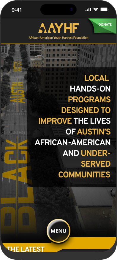
Desktop Design
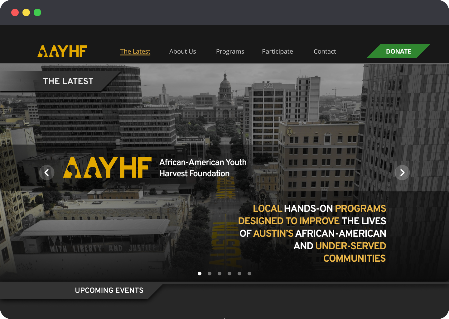
Homepage banner
While the design followed a mobile-first approach, I ensured full responsiveness across devices, including a tailored layout for desktop users.
On desktop, the long-scroll experience is preserved but enhanced to take advantage of the larger screen:
A wider grid improves readability and visual balance
A sticky header menu allows quick access to key actions like donating and volunteering
Impact visuals and program content have more space to stand out
Desktop Wireframes

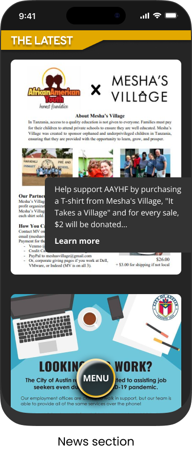
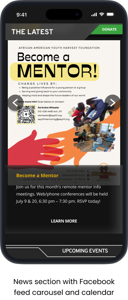
News and updates carousel displaying recent Facebook posts
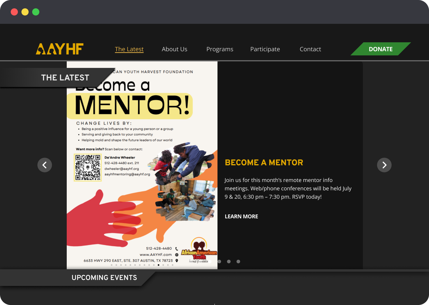
News and updates carousel displaying recent Facebook posts
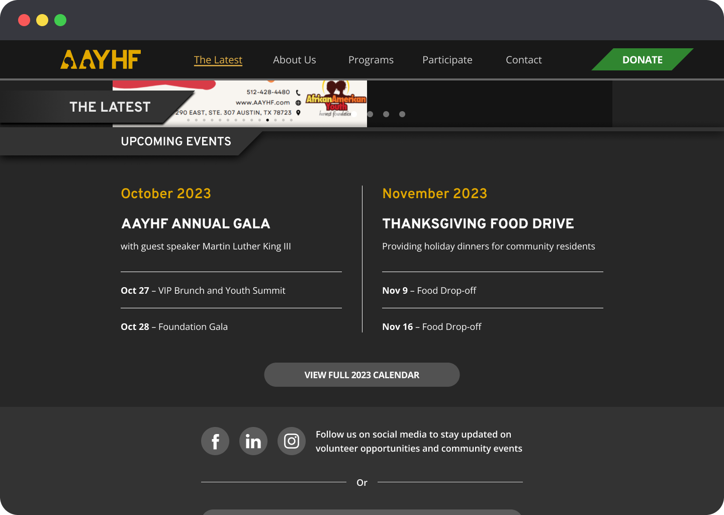
Upcoming events calendar
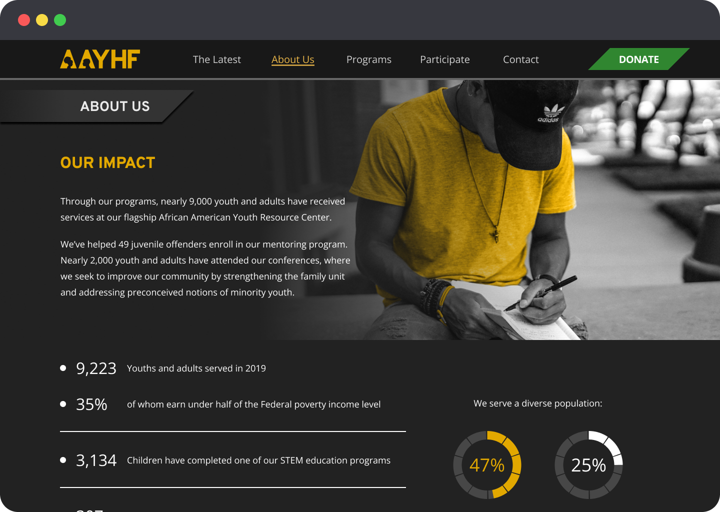
Impact statement and statistics
Values
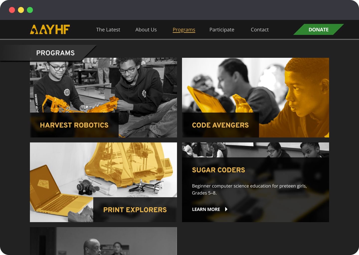
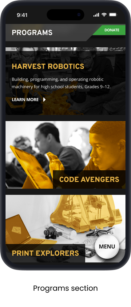
Programs section
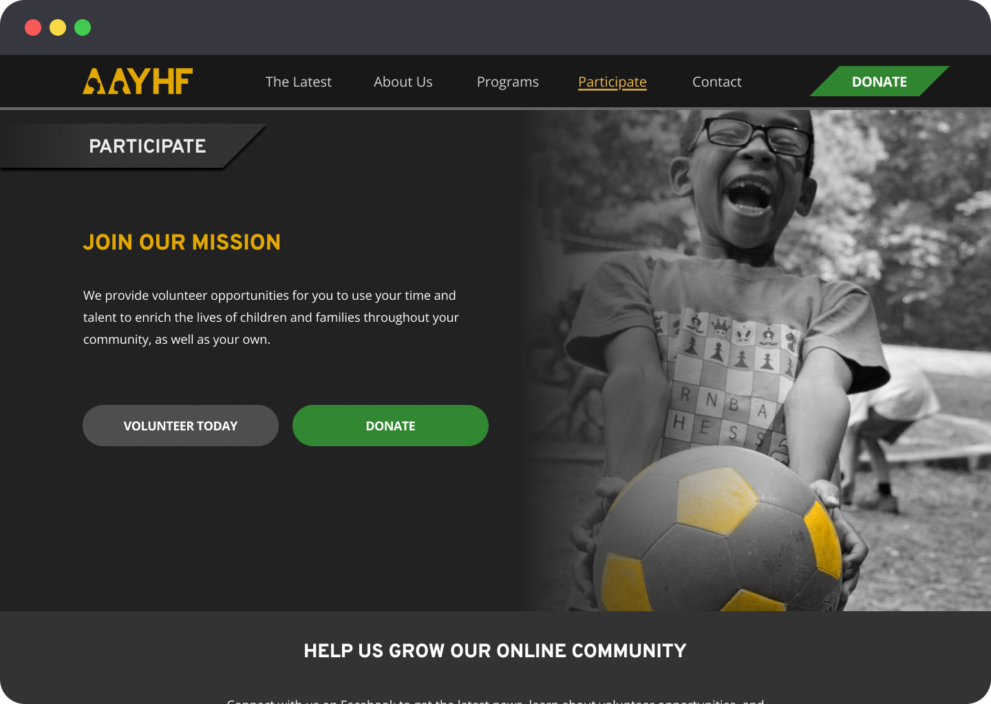
Volunteer signup call-to-action
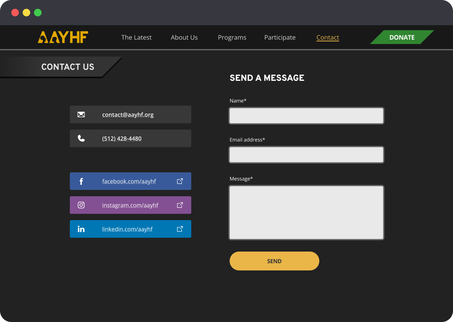
Contact section
Final Mobile Design
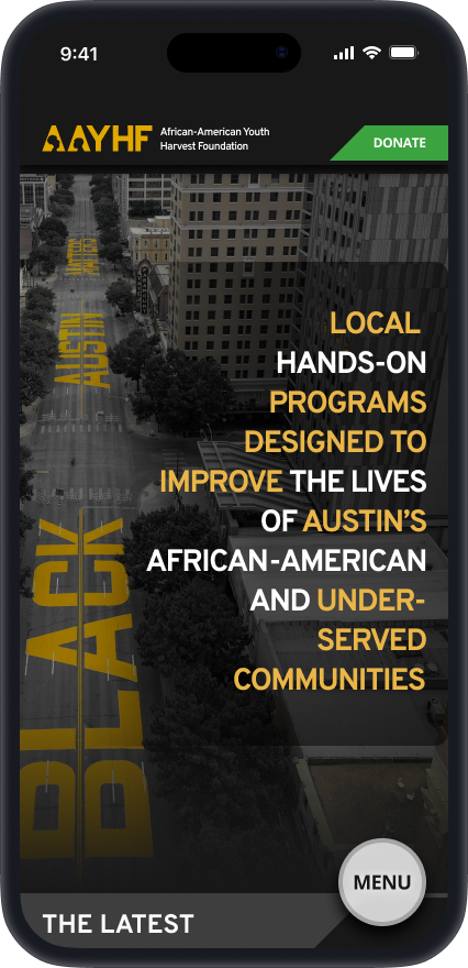
In the final iteration, all research, testing, and stakeholder feedback culminated in a streamlined, user-friendly website. The design emphasizes clarity, trust-building, and ease of action across devices.

Key updates included:
A long-scroll homepage introducing the mission, programs, and impact
A redesigned vertical menu, with links arranged in the same order as the homepage sections for intuitive navigation
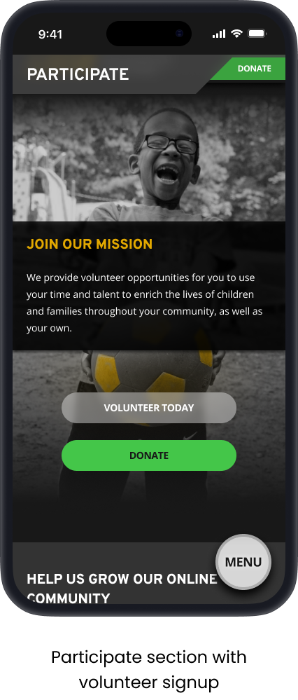
Dedicated pages for donation, volunteer sign-up, and program enrollment
An updated donation page FAQ answering common supporter questions (e.g., how donations are used, how to cancel a recurring donation), helping build trust and transparency
A Facebook feed carousel and new event calendar in the “Latest” section, designed to integrate with stakeholder workflows and support the long-scroll format
Rewritten site copy for greater clarity and tone consistency
A fully responsive layout, optimized for both mobile and desktop
Final Mobile Prototype
Impact & Takeaways
This project was a rewarding opportunity to design for a community-focused nonprofit while balancing user needs with stakeholder goals. Grounded in user research, the final design addressed major issues like confusing navigation, low mobile usability, and unclear donation flows.
Key improvements included:
A streamlined long-scroll homepage to guide users through the mission and offerings
A clearer, trust-focused donation experience with FAQs and preset amounts
An intuitive vertical menu matching the page structure
Integration of stakeholder tools like the Facebook feed and event calendar
The stakeholder was very happy with the final result, especially the ease of navigation, mobile responsiveness, and improved donor engagement.
This project strengthened my skills in user-centered design, iteration, and cross-functional collaboration. If revisited, I’d explore deeper strategies for recurring donations and long-term supporter engagement.
Tools Used:
Figma | Zoom | Google Forms | Optimal Workshop | Miro | Adobe Photoshop & Illustrator
TL;DR
Increased site clarity, mobile usability, and donation visibility
Conducted full-cycle UX process: research → testing → final design
Delivered high-fidelity, mobile-first responsive website + design system
Let’s connect
For any opportunities, questions, inquiries, or if you’d like me to consult on a project, reach out to me!