
AI Sustainability Explorer
Making the Environmental Impact of AI Easier to Understand
AI users regularly compare tools based on performance, features, and cost, but the environmental impact of those tools is much harder to evaluate. I designed a sustainability dashboard that translates complex environmental data into a clear, visual comparison experience.
Project Type: Conceptual dashboard design
Role: UX/UI Designer
Tools: Figma
Deliverables: Low-fidelity wireframe and high-fidelity dashboard states
The Problem
Millions of people use AI tools every day, yet most have little visibility into the environmental impact of the models they choose. Information about energy consumption, carbon emissions, and sustainability practices is often fragmented, highly technical, or difficult to compare across providers.
Users who want to make more informed decisions need a clearer way to understand how different AI models balance environmental impact, performance, cost, and user satisfaction.
The Goal
Create a centralized platform that allows users to
Compare the environmental impact of different AI models.
Understand technical sustainability metrics without specialized knowledge.
Evaluate environmental impact alongside performance, cost, and satisfaction.
See how their own AI usage contributes to energy consumption and carbon emissions.
The primary users are people who use AI tools and want to make more informed decisions about which platforms and models they use or support.
Organizing Complex Information in Low-Fidelity
The central design challenge was deciding how to present several different types of information without overwhelming the user.
I organized the dashboard around two levels of information:
Model comparison allows users to evaluate AI models using consistent environmental and performance metrics.
Personal impact shows logged-in users how their own activity contributes to energy use and estimated carbon emissions.
The most decision-relevant information is presented first, while charts and supporting metrics provide additional detail for users who want to investigate further.
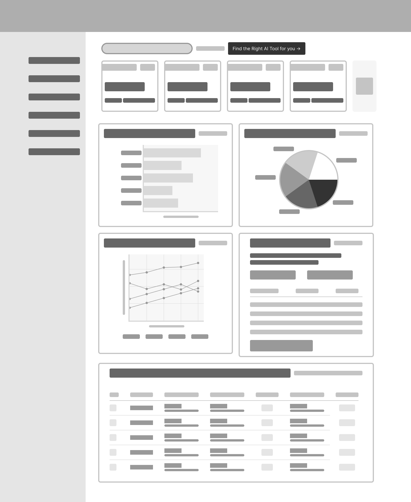
The low-fidelity wireframe established information hierarchy, comparison structure, and chart placement before visual styling.
The Dashboard Experience
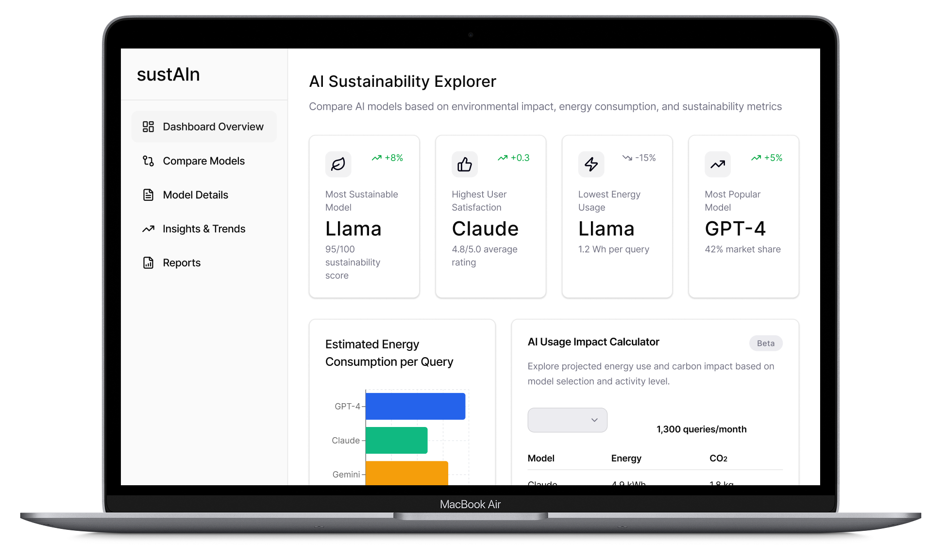
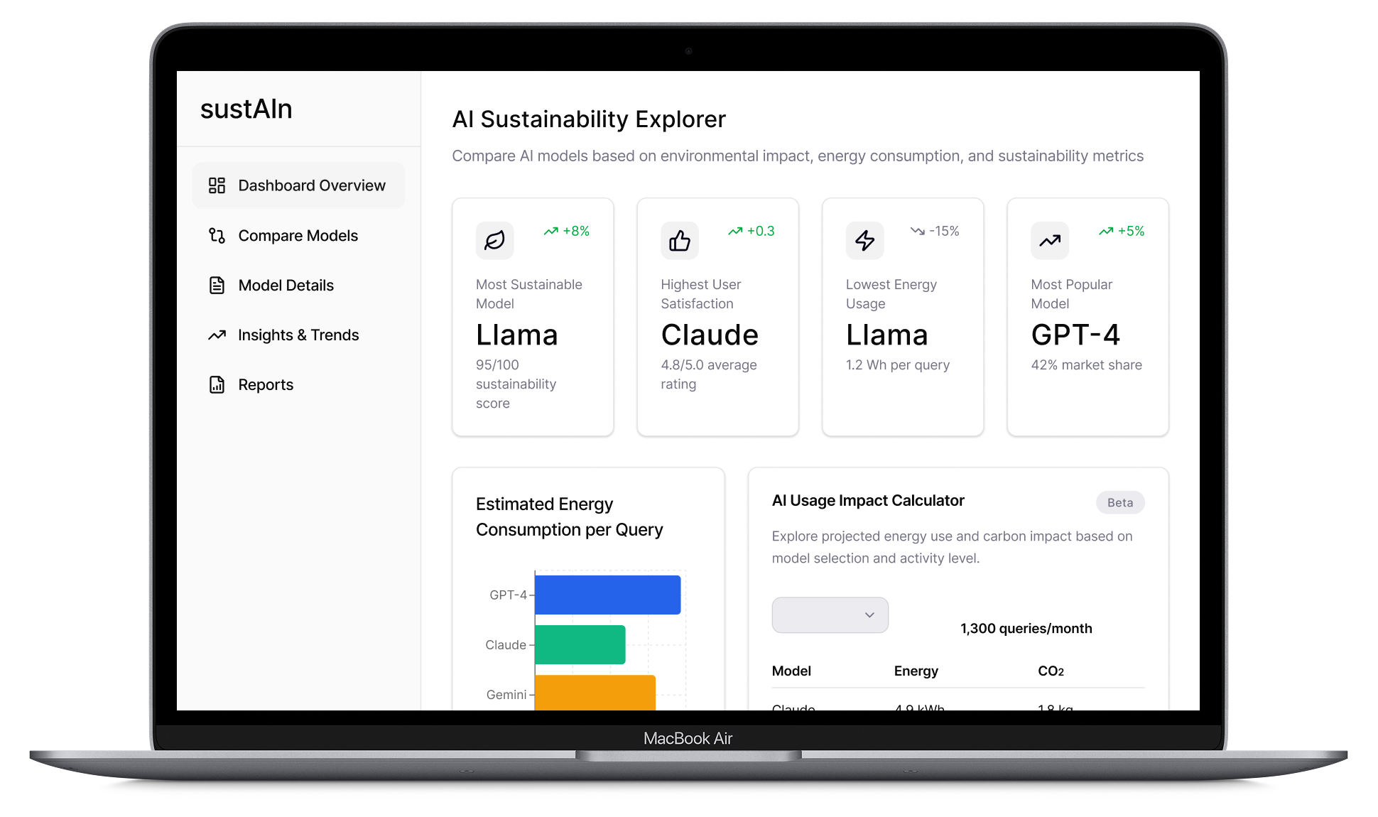
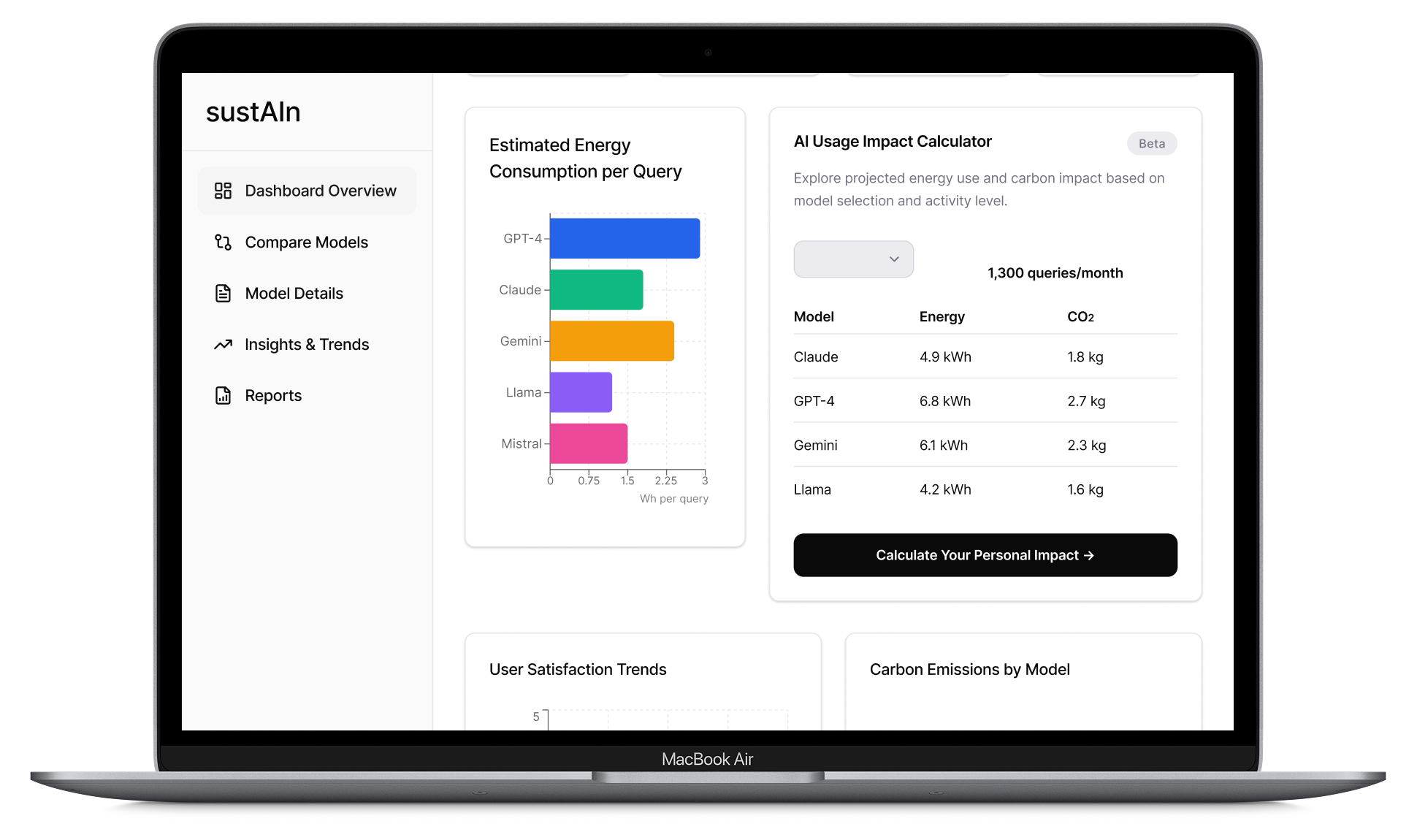
The main dashboard combines summary statistics, comparative data, and visual trends within one screen.
Key elements include:
A model comparison table for reviewing sustainability, cost, performance, and user-satisfaction metrics together.
Energy-consumption comparisons that translate model usage into a consistent unit.
Estimated carbon-emission and annual energy-use visualizations.
Satisfaction and performance trends that prevent environmental impact from being evaluated in isolation.
Search and filtering controls that help users focus on relevant models or providers.
The interface uses cards, charts, spacing, and clear typographic hierarchy to separate information into scannable sections. Repeated visual patterns make it easier to compare metrics without requiring users to interpret every data point individually.
Personal Impact States
After signing in, the dashboard adapts to include statistics based on the user’s own AI activity. These personalized states show how the same interface can support both general exploration and individual impact tracking.
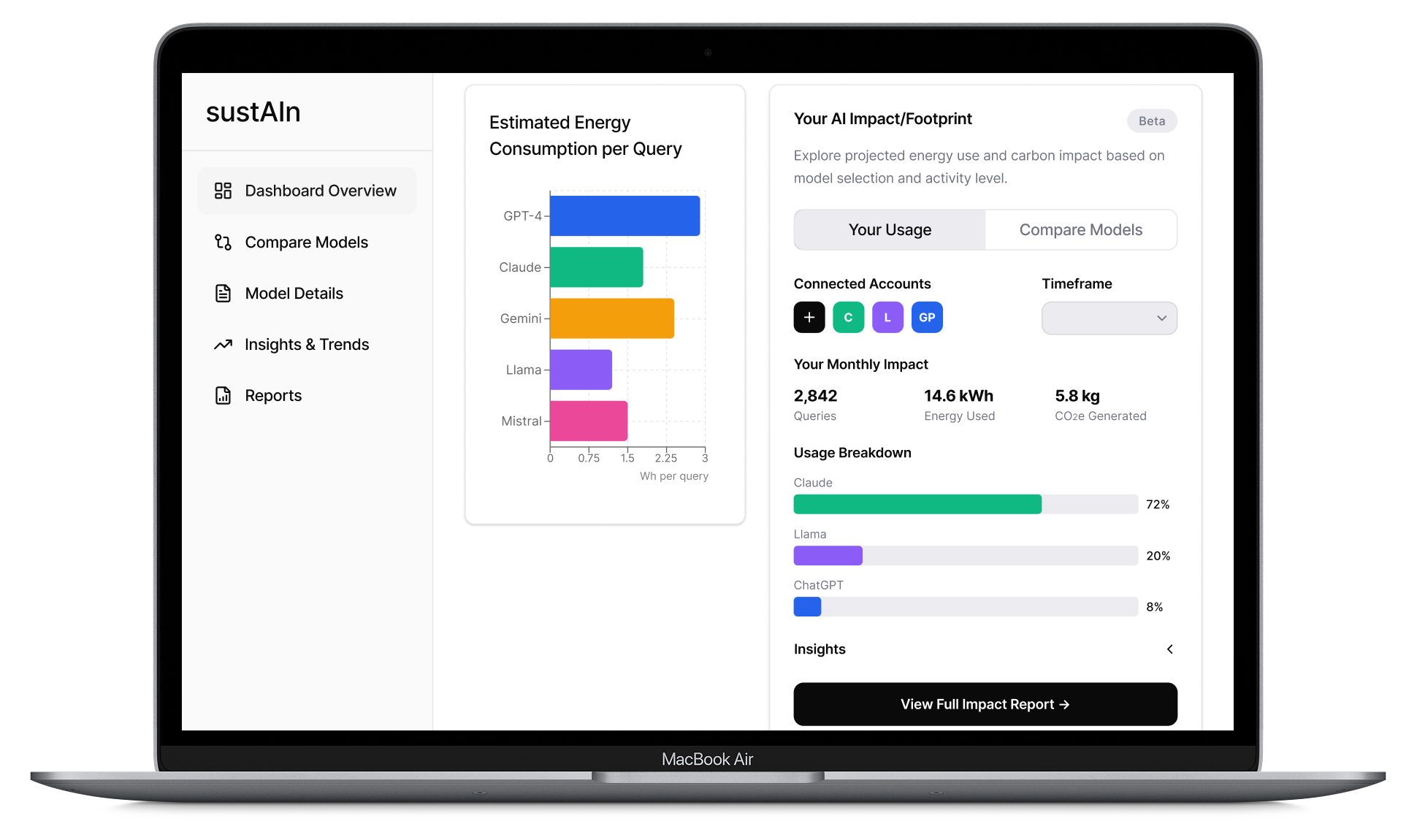
The logged-in state introduces personal usage statistics while preserving the broader model-comparison tools.
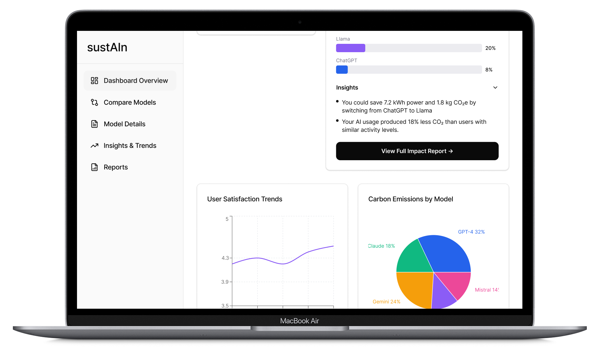
Personalized insights translate the user’s AI activity into actionable recommendations, such as how much energy and carbon emissions they could reduce by switching models.
Outcomes
The final concept shows how environmental information can become a visible, actionable part of the AI-selection process rather than remaining buried in technical reports or separate sustainability disclosures.
The dashboard turns complex information into a clear, scannable decision-making experience by combining model comparisons, environmental metrics, performance data, and personalized usage insights in one interface.
A future phase of the project would involve testing the dashboard with users to validate the data visualizations and information hierarchy, then evaluating how effectively it supports decision-making as part of a broader product flow.